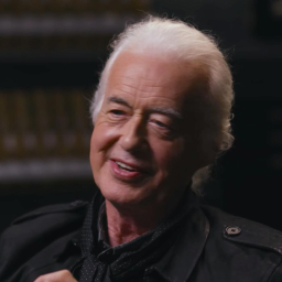
Avatar
It’s more than a picture with curved corners. It’s a vibe, subtly revealing secrets. A cheeky peek into depth, grabbing more than just your gaze.
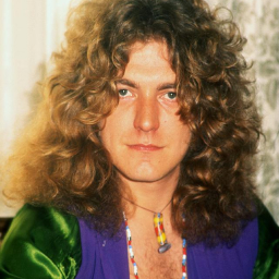
Basic
It ain't just a pic with curved corners, for real. It's the whole vibe, whispering secrets without a peep. A cheeky sneak into the deep, snatching more than your eyes can peep.
Installation
If you hit any issues, make sure you check out the installation guide here for more information.
Manual Installation
Anatomy
Fallback
If the image fails to load, the avatar will fallback to the initials.
Shape
By default, the avatar is a circle. You can change it to a square by using the shape prop.
Size
By default, the avatar is medium. You can change it to small, large or extra-large by using the size prop.
Avatar Group
You can use the AvatarGroup component to display a group of avatars.