Prologue
Getting Started
Dark Mode
Colors
Drag-and-drop
Forms
Utilities
Sidebar
Sidebar is a component that helps you organize your content and navigation.
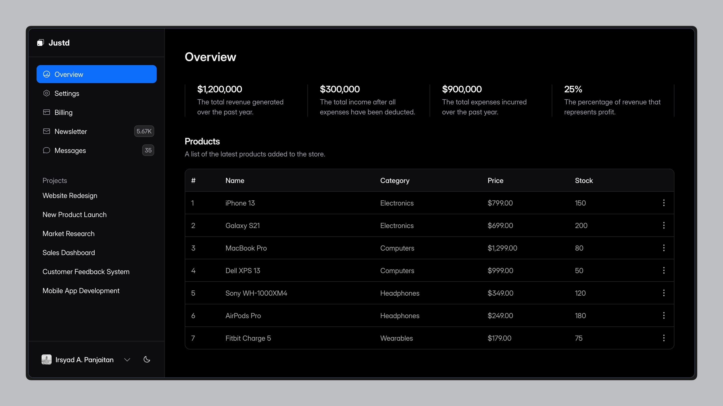
Basic
I can't display a live example here. Click on the image to view it in full screen, or here.

Installation
If you hit any issues, make sure you check out the installation guide here.
Composed Components
When you plug this component from the CLI, it autoloads all the composed components. No need to toss 'em in one at a time.
The Sidebar's decked out with several components to make it bangin'.
Manual Installation
Sometimes, using the CLI is the way to go, so make sure you install the necessary dependencies for the components you want to use.
Anatomy
Import the components and use them as shown below, adapting the structure to fit each component.
Creating a Sidebar
There are several ways to create a sidebar. Let's begin with the most straightforward approach.
App Sidebar
Imagine you're building a dashboard; you'll likely need a sidebar that lists all your projects, teams, and settings.
Layout
Once you've created the sidebar, you can wrap it inside a layout component. Here's what it looks like:
Done
Great job! You've successfully created a sidebar. The result can be seen here.
Using the Layout
There are several ways to use the layout, depending on your framework. Or, if you're not using any framework, you can simply apply the layout component.
Common Usage
A typical approach is to wrap your content with the layout like this:
<AppLayout>
  {/* your main content */}
</AppLayout>
Inertia.js
If you're using Inertia.js, you can implement a persistent layout. Here's how it looks:
Home.layout = (page: React.ReactNode) => <AppLayout children={page} />Next.js
If you're using Next.js, there's no extra configuration needed. Simply create a page component and ensure it inherits the layout like this:
app/dashboard
├── app-sidebar.tsx
├── layout.tsx
└── page.tsx
Collapsible
By default, the sidebar is collapsible with three options for collapsibility: offcanvas, dock, and none. When set to dock, the sidebar will be pinned to a specified location, displaying an icon and tooltip by default. You can see an example of this in Sidebar 04.
Offcanvas
This is the default collapsible type. When the trigger is clicked, the sidebar slides out.
<Sidebar collapsible='offcanvas' />Dock
This collapsible type is used in the sidebar of this documentation. Clicking the trigger causes the sidebar to slide out.
<Sidebar collapsible='dock' />None
Choosing the none type ensures the sidebar is static and cannot be toggled.
<Sidebar collapsible='none' />Intent
There are three types of sidebar intents: sidebar, floating, and inset, each with distinct behaviors.
Sidebar
This is the default intent and the most common style for sidebars.
<Sidebar intent='sidebar' />Floating
Using the floating intent, the sidebar will be fixed at the bottom of the screen, similar to a modal. Fullscreen example can be seen here.
<Sidebar intent='floating' />Inset
With the inset intent, the sidebar is also fixed at the bottom of the screen, resembling a modal. Fullscreen example can be seen here.
<Sidebar intent='inset' />Default Open
The sidebar's default open state can be managed using the defaultOpen prop.
<Sidebar.Provider defaultOpen>
  <Sidebar />
  <Sidebar.Inset />
</Sidebar.Provider>
Trigger
The trigger is a button that toggles the sidebar on both desktop and mobile devices. On desktop, it collapses the sidebar, while on mobile, it opens the sidebar within the <Sheet/> component.
<Sidebar.Trigger/>Rail
<Sidebar.Rail/> is a button that toggles the sidebar, positioned as a slim bar along the sidebar's border rather than a traditional button at the top. It’s typically placed beneath the <Sidebar.Footer/>. To see the difference in action, compare Sidebar 01, which includes the rail, with Sidebar 02, which does not.
<Sidebar.Rail/>Controlled
To manually control the sidebar's state, use the isOpen prop. When isOpen is set to true, the sidebar opens; when it's false, the sidebar closes.
export function AppSidebar() {
  const [isOpen, setIsOpen] = React.useState(false)

  return (
    <Sidebar.Provider isOpen={isOpen} onOpenChange={setIsOpen}>
      <Sidebar />
    </Sidebar.Provider>
  )
}
Modal
Sometimes, you may want a modal to open when a user clicks a sidebar item. You can control the modal's visibility using the isOpen prop, which is especially useful when managing multiple modals. However, if you only have one or two modals, you can simplify by wrapping them directly within the <Modal /> component like this:
<Sidebar.Section title="Projects">
  <Sidebar.Item icon={IconCube} href='#'>All Projects</Sidebar.Item>
  <Modal>
    <Sidebar.Item icon={IconPlus}>Create New Project</Sidebar.Item>
    <Modal.Content>
      <Modal.Header title="New Project" />
      <Modal.Footer>
        <Modal.Close>Close</Modal.Close>
      </Modal.Footer>
    </Modal.Content>
  </Modal>
</Sidebar.Section>
See the Sidebar 05 example for a more detailed implementation.